XIYU is a Shanghai-based new-style seafood hotpot restaurant. It's a blend between fine dining and traditional hotpot. XIYU serves a modest hotpot to each diner to maintain a more suitable social distance while allowing everyone to have a nice hotpot moment with friends.
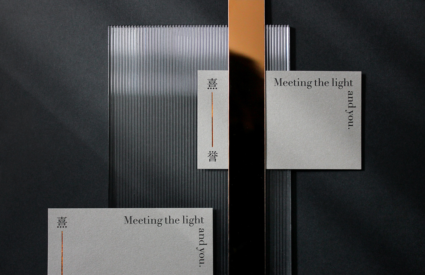
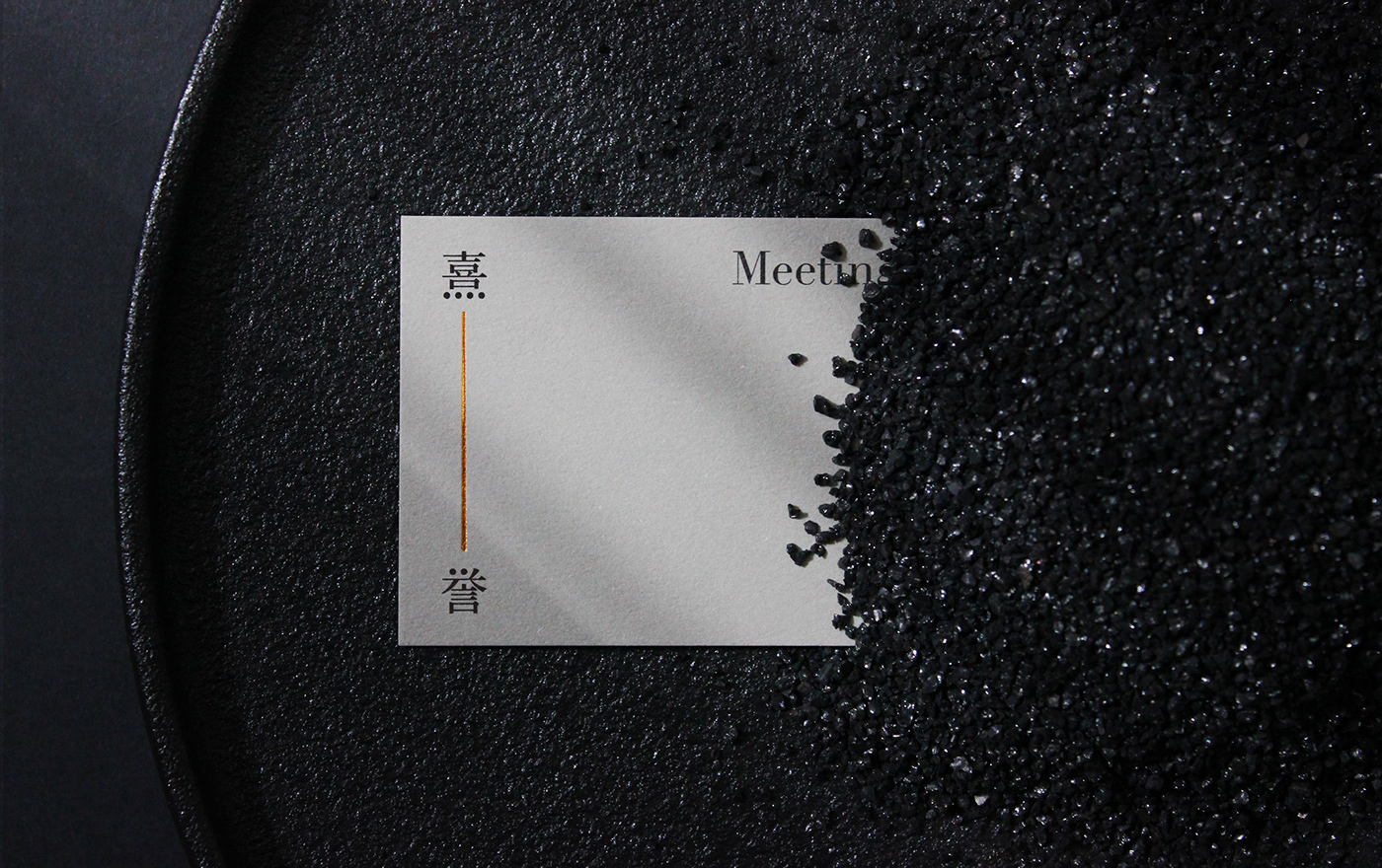
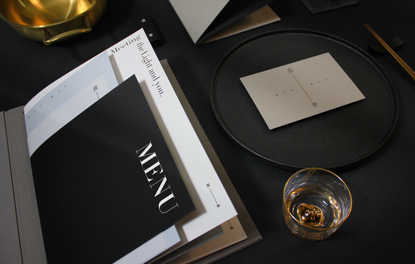
XIYU in Chinese means “Dawn Light” and “Glad to Meet." As the slogan “Meeting the light and you.”XIYU wants to connect people with delicious food and a beautiful environment.
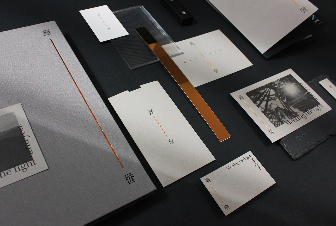
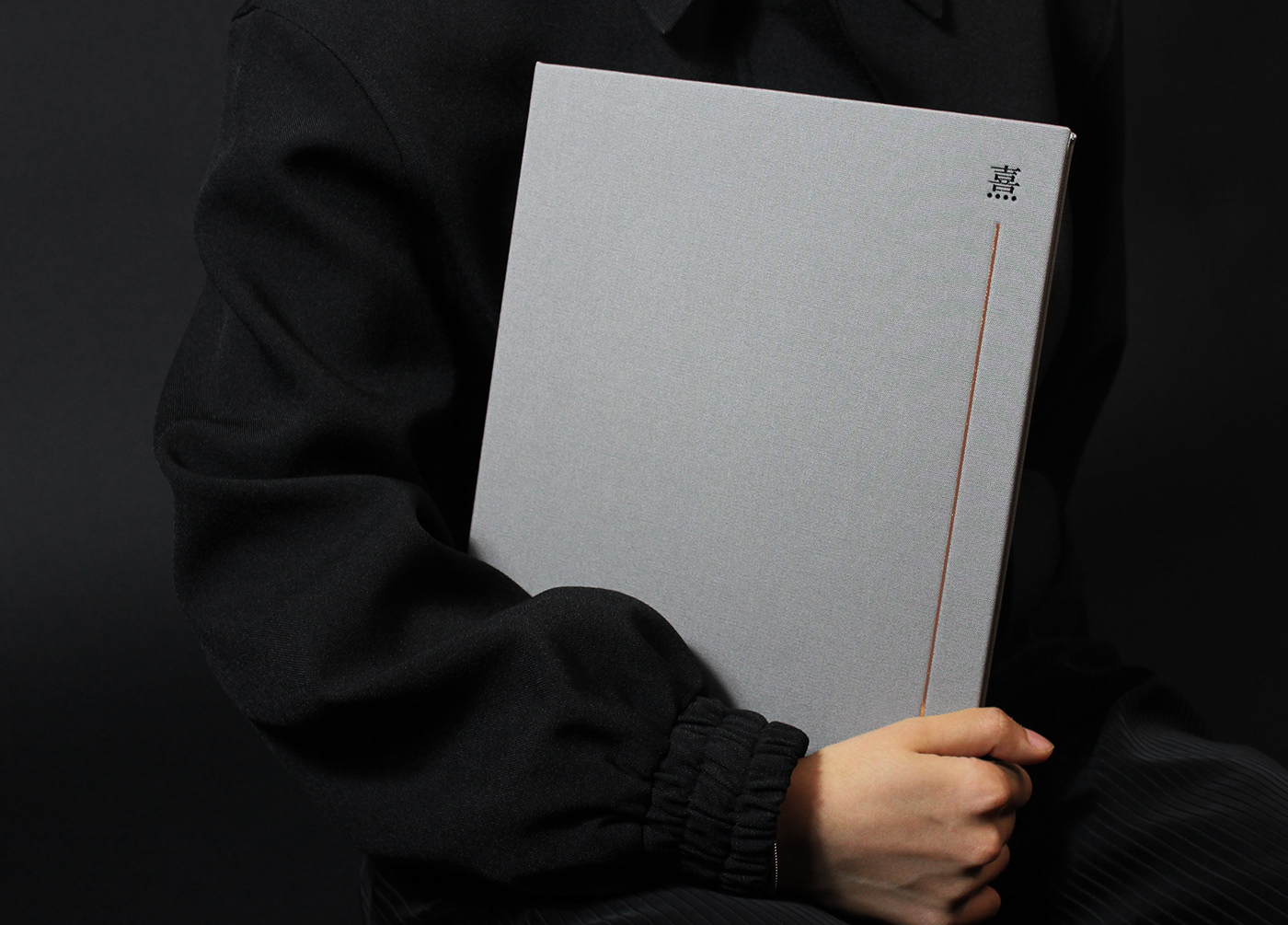
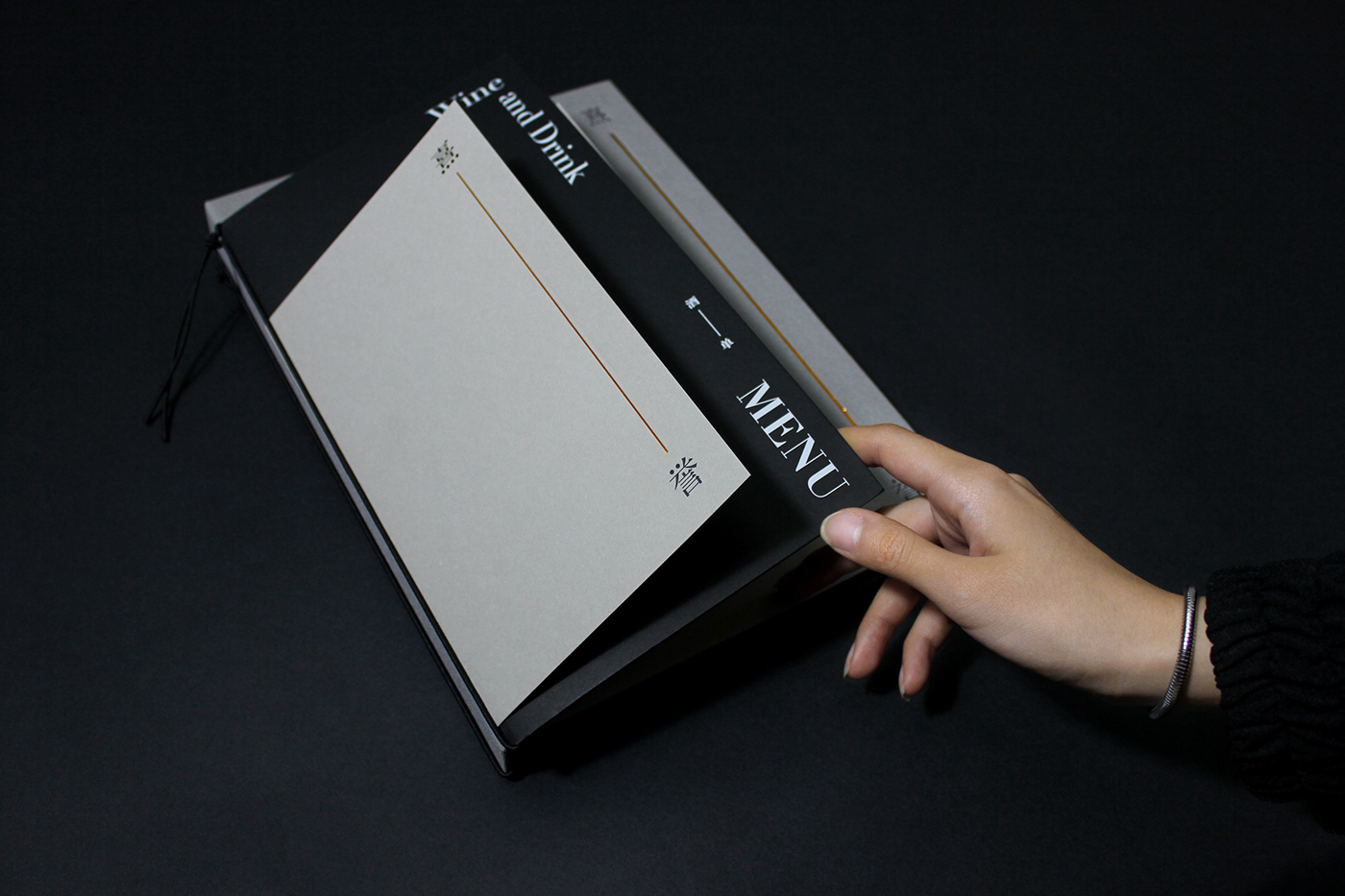
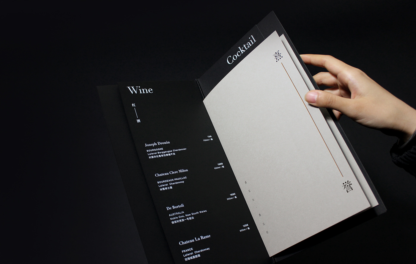
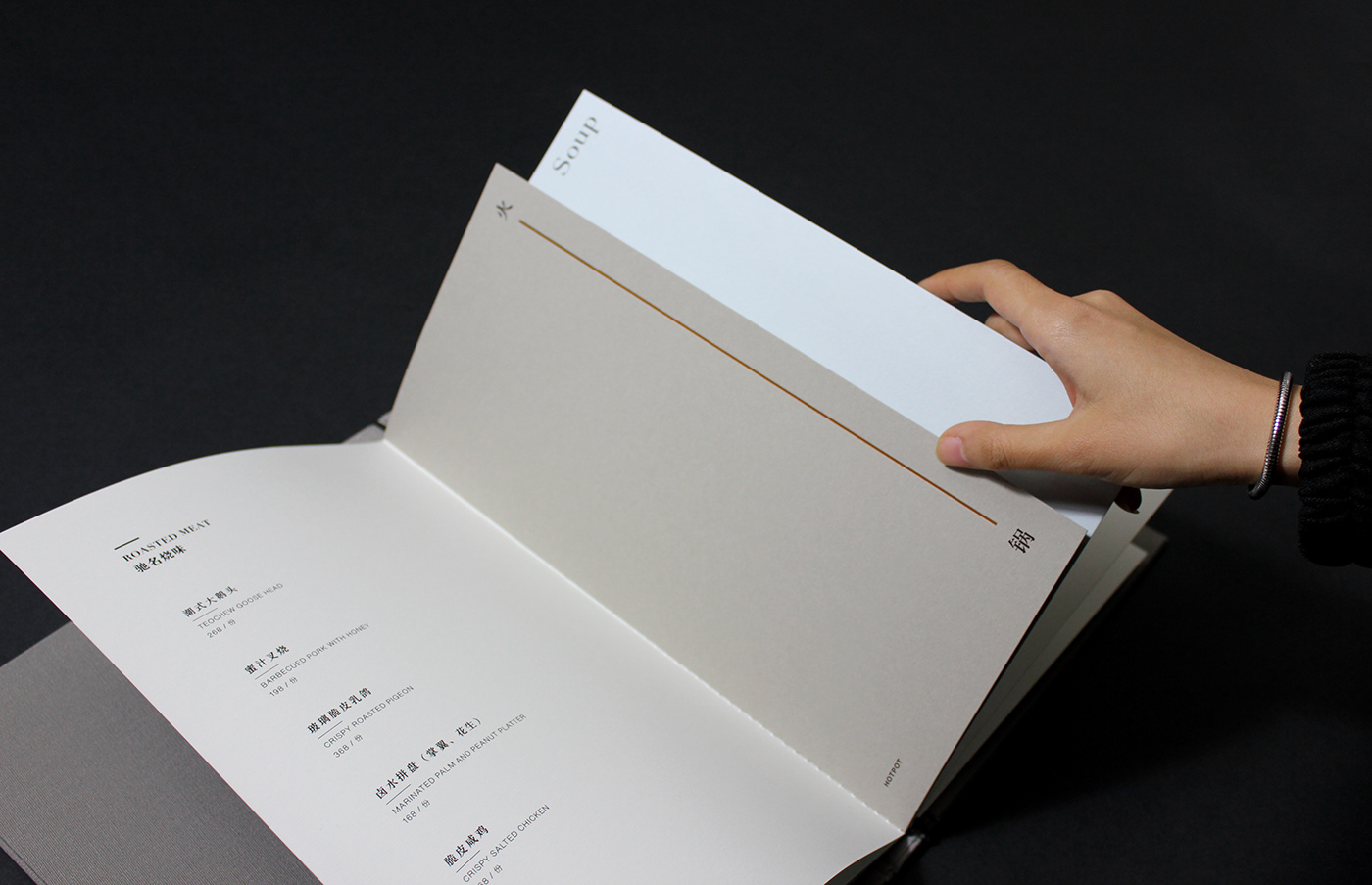
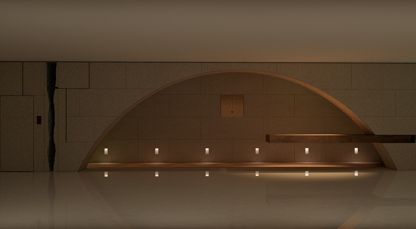
The brand identity's visual concept is to connect objects with a thread of light. A vertical golden line connects two characters. The line in-between can be stretched with varying media heights as a flexible logo. The color palette is inspired by various lighting colors ranging from black to white and a golden tone to add a luxurious touch to the production.
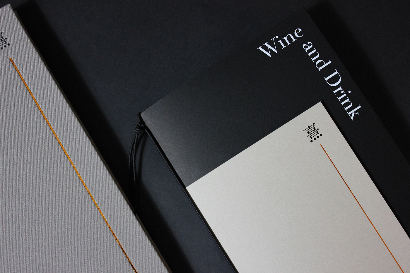
XIYU’s brand identity includes stationery, menus, other prints, advertising, and the restaurant signage system. The dish menu and wine menu employ various sizes of art paper, with thread bookbinding and cover bronzing. The entire visual system creates an abundant and delicate food experience.
Concept & Design / Iris Fan
Visual Design / Guohao Yuan
Photography / Iris Fan
Model / Wenhui Gao
Logo Motion / Wenhui Gao